Wayward Tattoo
Role
UX/UI Designer, Content Strategist, Project Manager
Tools
HTML & CSS, Photoshop,
Mural, Sketch
Time
1.5 months
Coffee
36 cups
Wayward Tattoo is an all-women owned tattoo studio in Madison, Wisconsin. They approached me earlier this year to design and develop their website before its grand opening and I jumped at the opportunity. I wanted to help support their mission of providing the community with a safe, artistic space where all bodies are welcome.
UX Deliverables: Project roadmap, task prioritization, sitemap, competitor analysis, user research, content strategy
“Kedar was fantastic to work with. She took the time to nail down our branding and asked all the right questions to feel it out. Her confidence and professionalism made it easy to put our complete trust in her abilities. Kedar created exactly what we were looking for and communicated the entire time. Our web presence is now a perfect representation of us, and so easy for the public to use. Kedar is top of the line and would highly recommend.”
Challenge
The Wayward site had to launch within a month and a half, so the biggest challenge of this project was making sure we could build something that met both the needs of the user and businesses owners within a short time frame.
Due to time and budget, this wasn’t a project I could accomplish on my own. We put together a small team that consisted of an additional UX designer with a specialization in content strategy, as well as a graphic designer and photographer to develop Wayward’s visual brand and design assets.
Requirements Gathering
We met with the Wayward Tattoo team for a kick-off meeting to gather the minimum amount of features the site needed in order to launch within a month and a half. Because the team wasn’t familiar with agile practices, we started with a short explanation of how we’ll deliver small batches of work at the end of each week until the site is ready to launch.
Prioritization of Requirements
Together with the shop owners, we used a simplified version of the MoSCoW technique to prioritize site requirements into different categories of importance. It was imperative we worked with the owners to identify these requirements so that the team had a shared understanding of what our focus will be and how success would be defined for the project.
Must Haves
Cover page to promote shop before launch
Shop mission statement
Welcome/about details for site and SEO
Artist bios
Instagram feed
Hours and contact
Branding (logo, typography, color, and photography)
Links to social media
Could Haves
Calendar of upcoming events
Tattoo aftercare info
FAQ page
Customer testimonials
Featured images of work for each artist bio
Won’t/Would Haves
Online store
Dynamic booking process
Site training
Project Roadmap
After task prioritization, I created a visual roadmap to provide a birds eye view of what the team will be working on throughout the coming weeks. The roadmap was meant to be a living document that represented the “best case scenario”, but could be adjusted as necessary if work or scope changed.
Like all projects, we had to be nimble because things don’t always go according to plan and this project was no different. The shop construction and graphic design was behind schedule, so design and photography wasn’t able to happen until after launch. We improvised until branding was able to catch up, but more on that later!

Technical Requirements
I originally thought I would use Wordpress with a custom developed theme for the site, but after talking with the shop owners, I quickly learned that wouldn’t be a feasible solution within their technical expertise, budget, and deadline.
It was important for the owners to be able to take ownership of the site after launch with no unexpected maintenance fees or security costs. Wordpress would require a developer (me) to ensure the site stayed up to date with upgrades, fix errors/bugs, and implement security patches. Wordpress also has a steep learning curve for those not as technically inclined, and the owners wanted something that was easy to use.
Although I love Wordpress and developing custom themes, I chose Squarespace as the solution for Wayward because all three owners were familiar with the software, maintenance is included in the cost, and most of their content is static so Wordpress would be a heavy solution for such a small site. Wayward could also upgrade their plan to include an e-commerce store in the future, which was also a requirement for them.
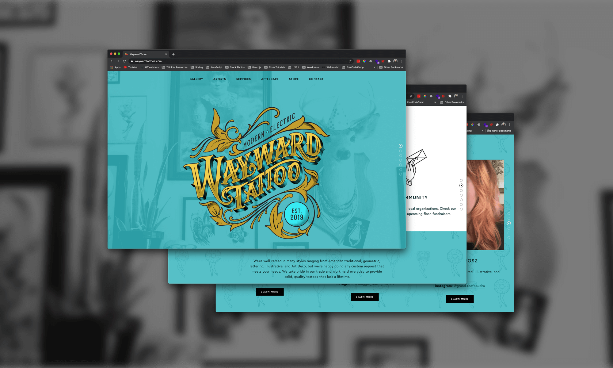
Cover Page
Getting started with the development phase, I connected the Wayward domain to their site and created a cover page that could promote the new shop while we developed the site under the hood.

Competitor Analysis
I chose a few well-known tattoo shops from around the country to perform a competitor analysis to figure out what they were doing well, and to discover gaps that allow Wayward to really shine in the market:

Screenshots from various tattoo sites around the country.
Key Takeaways
Many sites except for Kings Avenue include a mission state of the business somewhere on the site. And if they do, many of those mission statements are long. On the web, we have less than 8 seconds to capture the attention of users, so we wanted to make sure Wayward’s mission statement was visible but easy to digest for users. We came up with a mission statement that included 3 of their key businesses principles paired with icons that one of the owners created themselves:

Wayward’s missions statement broken down into three easy to digest bullet points.
Many of the image galleries of each shop are hidden behind menu items or the user needs to go into each artist profile to find images of work. For Wayward, we wanted to make browsing artwork one of the focuses of the homepage so that users could quickly determine whether or not the shop fit their style.
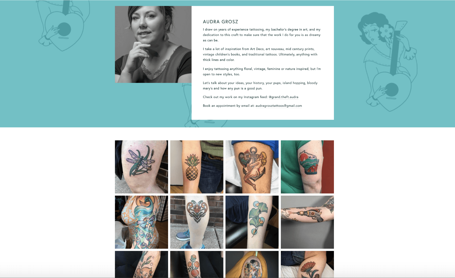
For most sites, the user has to read the full artist bio to get a sense for their style and experience level. We loved how Moon Tattoo makes the description of the artist’s style the first thing the user reads in their bio. We wanted to improve upon this and only include a short description of the artist’s style, and leave a lengthier description of the artist in a detailed bio page if the user wanted to read more:

The short description of each artist’s style on the Wayward homepage. We also included a quick link to their personal instagram where they regularly post work.
Moon Tattoo is really the only site that displayed the studio’s different services, which made them stand apart from the rest. We wanted to incorporate this into the Waywrd site to hopefully decrease calls asking about what they offer; it’s common for people to think tattoo shops also do piercings, but it’s not something Wayward offers. It was also important for Wayward to callout walk-ins details, consultations, and that they offer cover ups for those who’ve recovered from a traumatic illness or surgery:

We worked with Wayward to craft descriptions of the services they offer.
User Interviews
I conducted 10 minuted interviews with 4 different people that we identified as target users for Wayward Tattoo. Two didn’t have tattoos but were interested in getting some, and the others currently have tattoos and hope to get more in the near future. I asked them the following questions:
Do you go to a particular shop or artist for your tattoos?
When visiting a tattoo website, what information are you typically looking for?
How many tattoos do you have?
Where do you go to find tattoo inspiration? (sites, blogs, apps, etc.)
How would you/do you search for a tattoo artist for your own work?
What information is most important to you when looking for a tattoo artist?
Key Takeaways
Most users look for a gallery of images to find out whether the shop include artists that fit their style. Knowing the artist and their details came secondary in terms of importance. For this reason, I placed “Gallery” as the first item in the main navigation, as well as making it one of the primary sections on the homepage:

Wayward Tattoo’s main navigation
Instagram is the primary platform where users search for tattoo artists and tattoo inspiration. It’s also where they go to find more work from tattoo artists, because it’s the primary app that artists use to display their portfolio. We added links to instagram in various places throughout the site (artist’s descriptions, artist’s profile page, and footer) to provide users with multiple entry points to different instagram accounts for the shop and its artists.
Users felt it was most important to see existing work from an artist that matched the style of the tattoo they wanted - this helped them gain trust for the artist. We wanted to make the style of each artist and their portfolio easy to find, so we asked each artist to curate the top 10 - 15 images that they thought best represented their work. We added these images to each artist’s portfolio. We also added patterned illustrations of their work as background images to their portfolio page to reinforce their personal style:
Content Strategy
After gathering more information about the wants and needs of the Wayward owners and their users, I created a map to show the architecture of the entire site that would help guide development. I also put labels on pages that would be created in version 2 of the project — we wanted to capture how those would fit into the site in the future, so that our thoughts were documented:

Sitemap of Wayward Tattoo. “V2” labels indicate that these pages won’t happen until version 2 of the project.
We decided to go with a hybrid blend of a single page site. The most important content of the site could fit onto a single page, and periphery content like artist bios, events, and FAQ pages were secondary and include more information so were better suited for standalone pages.
One of the biggest paint points found in both the user interviews and competitor analysis, is that finding artwork is often buried beneath multiple links. A single page forced content to be short, concise, and easily discoverable. However, this approach does have some SEO drawbacks that we’re monitoring now that the site has been crawled by Google.
Design & Development
Design and branding was perhaps the most challenging part of the project. Due to various unexpected reasons, Wayward’s logo design wasn’t able to be complete until after the site went live. And renovations of the shop were delayed, so the photographer wasn’t able to take photographs until much later than expected.
So because we didn’t have photographs, a color palette, or a logo to work from, we improvised and chose design elements that weren’t too prescriptive or opinionated. We also knew that we wanted to create custom patterns of artwork from each tattoo artist for supplemental background imagery, so that’s a design element we were able to implement without any help from graphic design.
After the site launched, we received the logo, photographs, and primary colors of teal, black, and gold that we integrated throughout the site; it was well worth the wait! The Wayward team was so happy to have a brand identity that represented who they are. You can see an example of the before and after of the site design below.
Hero section before design
Before we received assets from the graphic designer and photographer, we improvised with illustrations from each tattoo artist — the bonus of working with a company full of creatives!
Hero section after design
The hero section is a design element that showcases the look and feel of how they described themselves: “clean, eclectic, modern, weird, traditional, and sassy.”
Go Live!
I was able to launch an MVP of the site a couple days before the deadline of May 18. We integrated the graphic elements and professional photographs shortly after launch when those deliverables were ready. So although there were unexpected delays in the roadmap, we managed to exceed expectations and create an alternative plan that provided Wayward with the ability to share and promote their new businesses.