WeRecycle
WeRecycle is a fictional app designed to help users determine what they can recycle no matter where they are, and learn simple ways to live a more sustainable life.

Challenge
As of 2015, humans have generated 6.3 billion metric tons of plastic waste, and only 9% of that waste has actually been recycled. Scientists predict that if present trends continue, by 2050 there will be 12 billion metric tons of plastic in landfills. That amount is 35,000 times as heavy as the Empire State Building.
Knowing the repercussions, how do we get people to recycle more?
Highlights
Role: UX/UI Designer
Time: 5 months
Tools: Sketch, Figma, Procreate, iOS Design System
UX Deliverables: Research plan, survey, user interviews and testing, competitor analysis, personas, content strategy, site map, user flows, prototypes
Coffee: 56 cups ☕️
User Research
I created a research plan to delve into the issue and uncover the various challenges users face with recycling. My research included a survey, five user interviews, and an ethnographic study. Initially, I thought WeRecycle would need to persuade people to care about the environment, but the reality turned out to be more complex.
Recycling survey with 91 respondents
Users face several challenges with recycling:
Convenience: Many users are less likely to recycle if it's not convenient, they're confused, or they're in a hurry, even though 95% of them care about waste and pollution.
Perceived impact: Almost half of users feel like they're not making a difference when they recycle. Some even believe the pollution problem is too large for individual actions to matter.
Lack of validation: Users don't feel confident about their recycling efforts because they receive no feedback on whether they're doing it correctly or effectively.
Confusion: 67% of people struggle with recycling due to confusion about what's recyclable, despite efforts to understand local guidelines. Many rely on intuition, leading to what's dubbed as "wish-cycling."

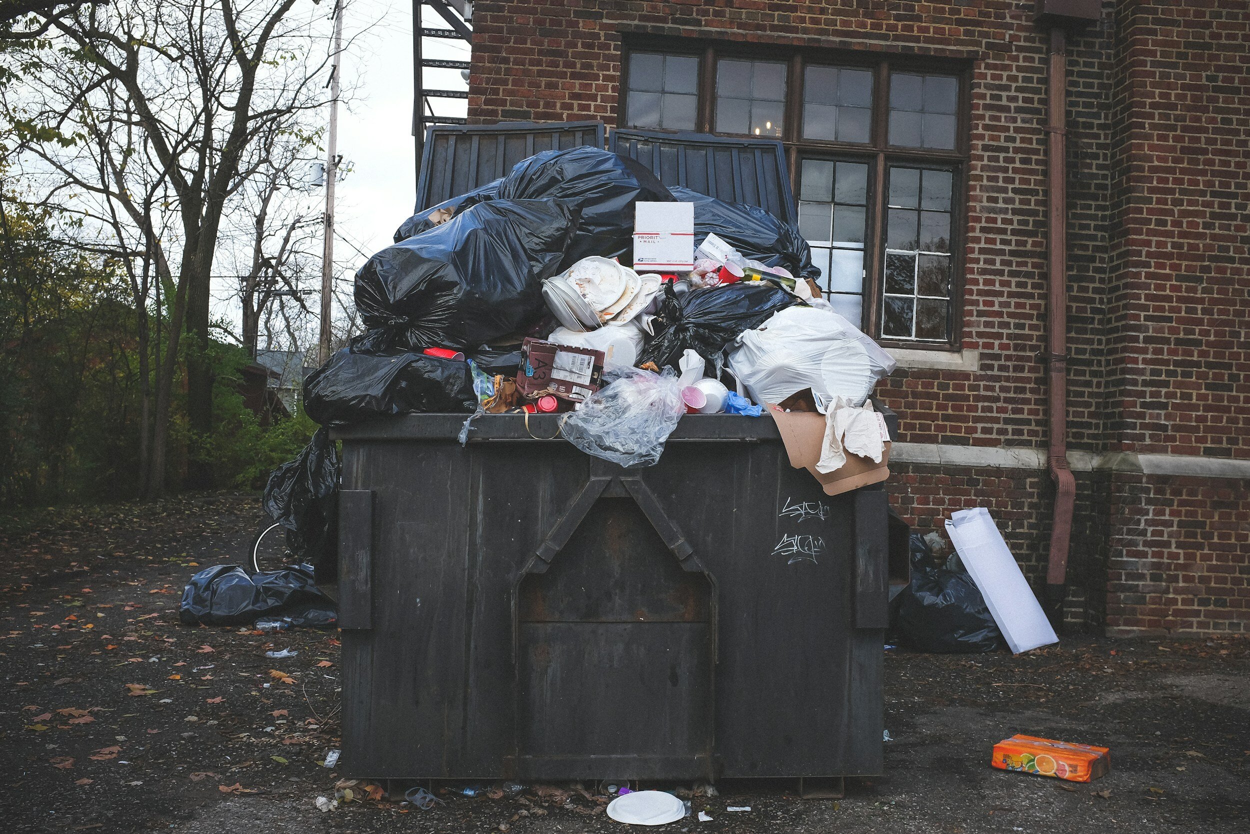
“Even when I know I should recycle, my subconscious still falls back on the cultural norm that whatever seems easiest at the time is good enough.”
— User interview
Ethnographic study
I followed the recycling habits of a conservationist for an afternoon while cleaning my fridge. I used my city’s recycling rules and regulations to research whether I could recycle something before throwing it away. This experience confirmed users' recycling challenges.
Main takeaways
Answers to recycling questions are hard to find.
My city’s website is not responsive and content is poorly organized.
If recycling is too hard, I don’t do it.
Found out the garbage bags I've been using to line my recycling bin for two years aren't recyclable..

This was my recycling bin after the experiement. I legitimately broke a sweat.
Competitor analysis
Now that I understood the recycling challenges people face, I explored 4 existing apps to see how they tackle these issues. Surprisingly, there are not many user-friendly environmental apps. They often struggle to balance gamification and education, with one aspect usually overshadowing the other.
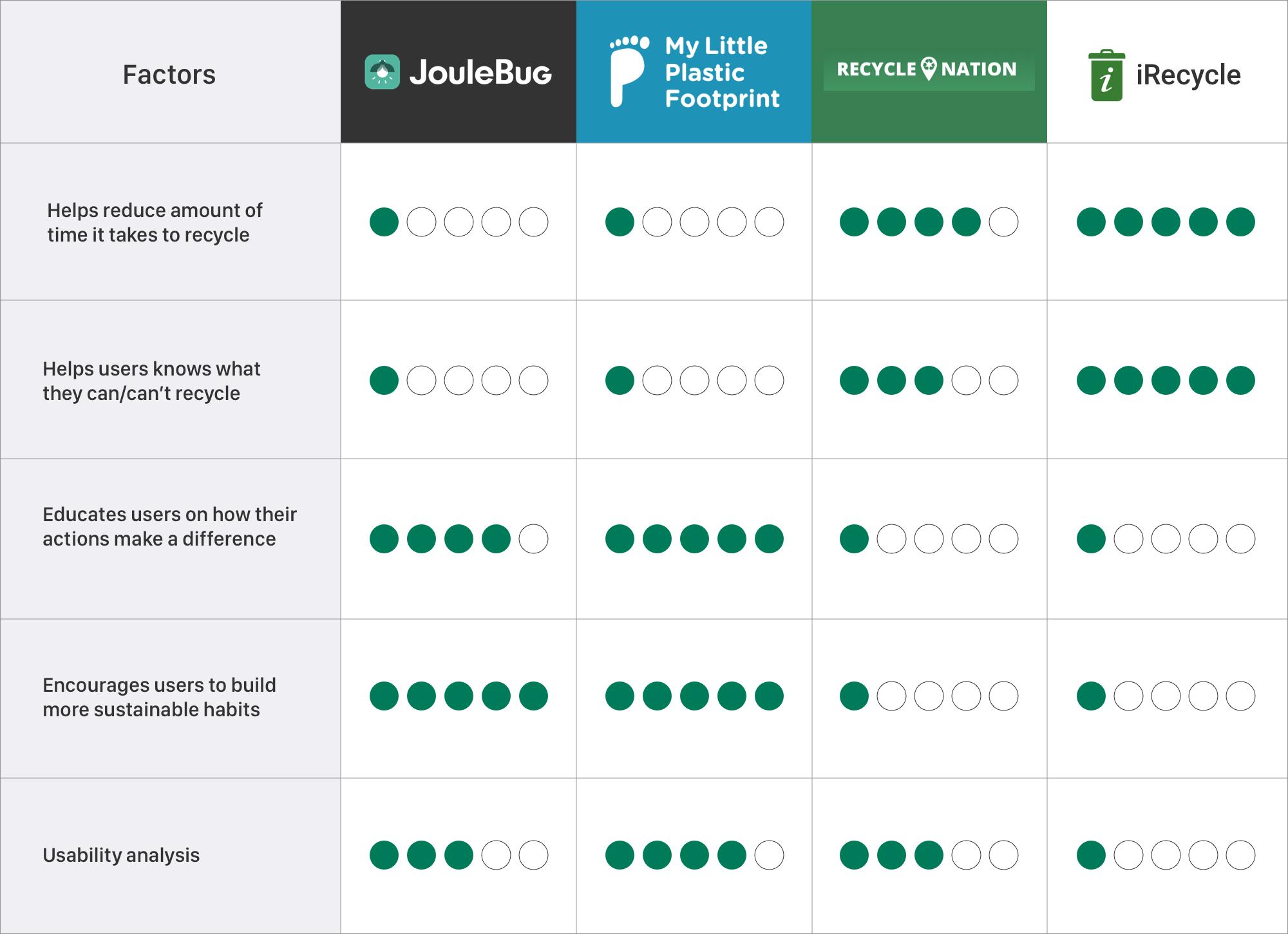
Key takeaways
iRecycle
Addresses top reasons people don’t recycle: findings bins and knowing what's recyclable.
My Little Plastic Footprint
Encourages accountability through pledges to improve the environment.
Users tend to be more committed when formally pledging to take action.
Joulebug
Offers achievements for eco-friendly actions.
Uses confusing terms like "buzzing," which may hinder user understanding.

iRecycle has the most potential
This app relies on input from many users to locate nearby waste bins. It also includes a guidebook to help users learn how to correctly dispose of various types of waste.
User personas
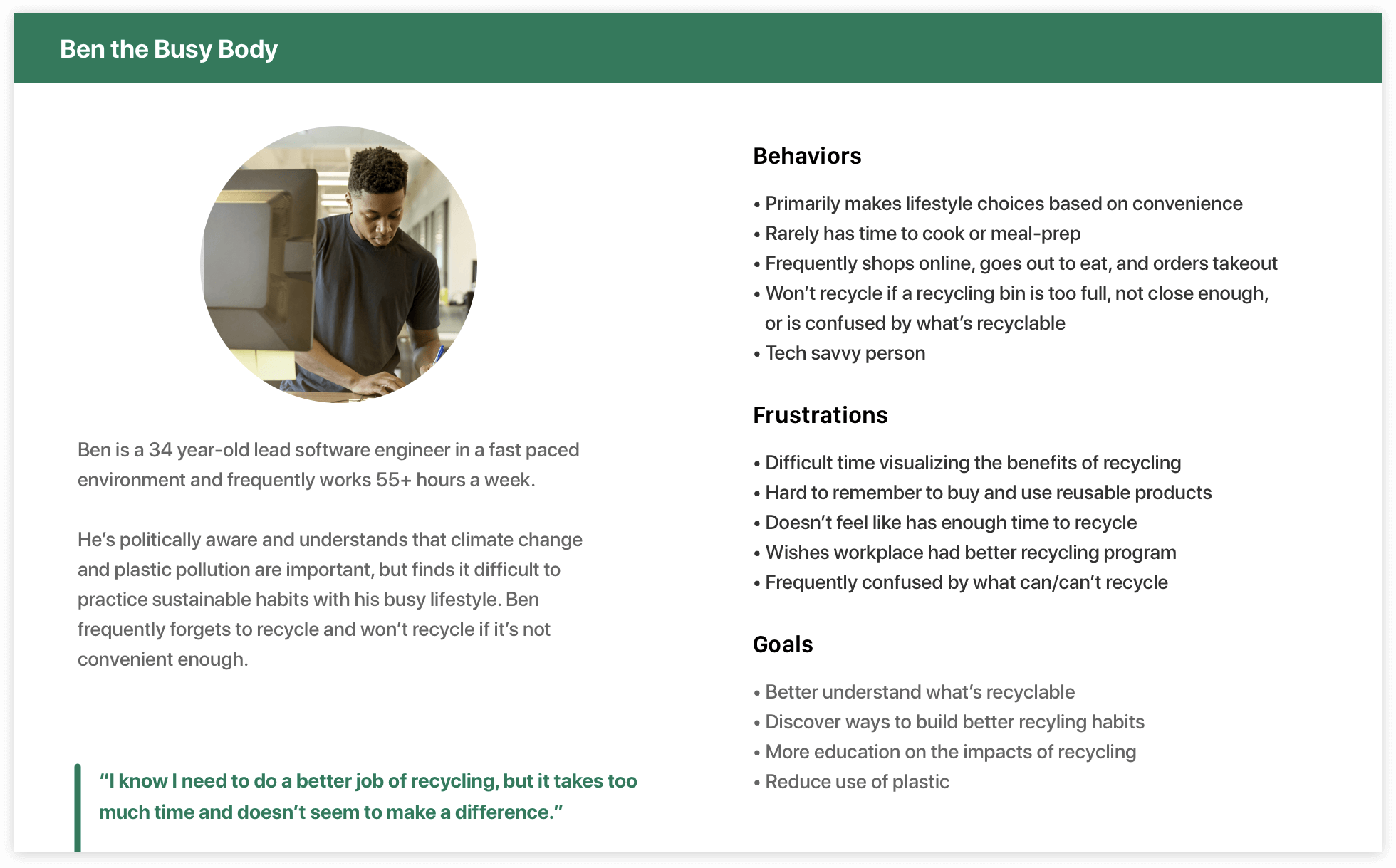
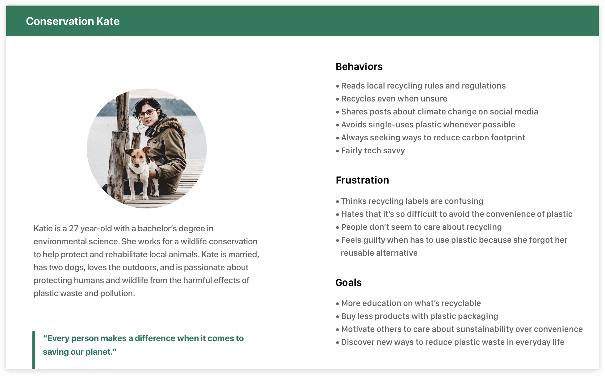
I developed two user personas based on the research data, representing the needs, wants, and challenges of users. These personas I (not so cleverly named) "Conservation Kate" and "Ben the Busy Body," embody the different characteristics and experiences common among many people.
Problem statement
People often find recycling confusing and inconvenient, but they're ready to make sustainable choices if they feel confident and motivated.
User Stories
After analyzing competitors, I saw a chance to blend fun challenges and environmental education in WeRecycle to motivate users to recycle confidently. I boiled down the must-have features to five: a map showing recycling spots, a tool to track what you recycle, lessons to learn more, badges for achievements, and a search tool using images.

Card sort
I conducted a card sorting activity both in person and online using Optimal Workshop, with participants reflecting WeRecycle personas: some passionate about waste reduction, others interested but feeling unsure due to time and knowledge constraints. This helped inform the organization of features for better information architecture.
I learned that users…
Understood "Map" as referring to the recycling map, allowing for a shorter header in the app.
Included "Tap to log recycling” in various categories; added it to the main navigation for quick access.
Combined recycling activity and achievements, placing them on the same screen for user convenience.

Sitemap and user flows
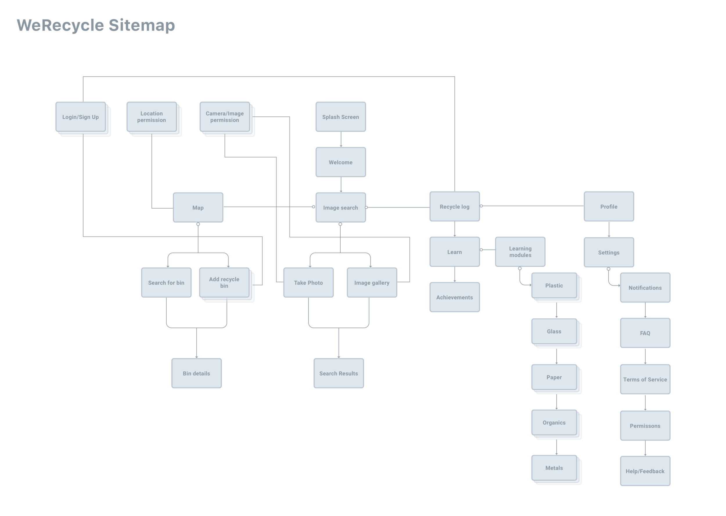
The data gathered from the card sorting exercise informed my sitemap and allowed me to see how users might relate to and make connections with the application:
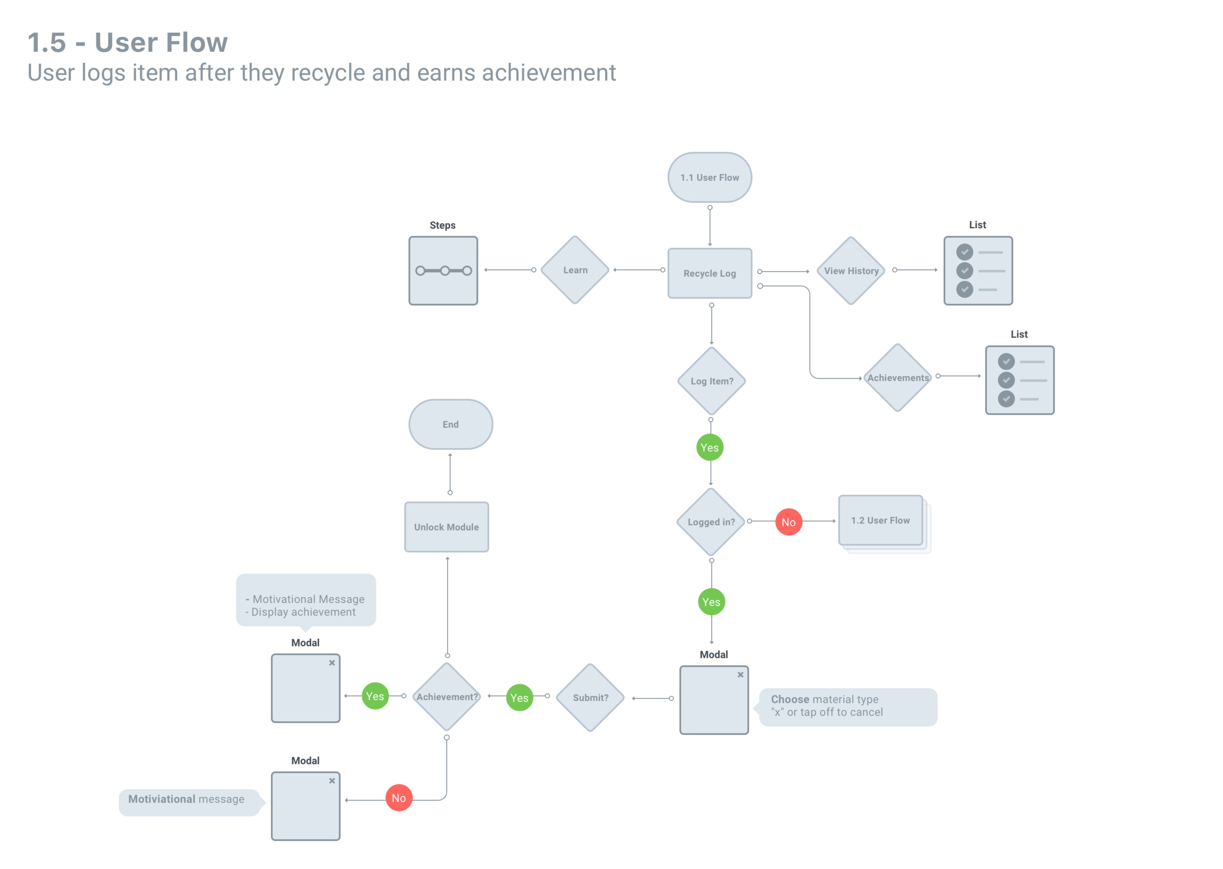
User flow examples
After the sitemap, I dove into creating user flows of each feature to get a birds eye view of how the user might navigate through the different features of the application.

Takeaways
One major insight from examining sitemaps and user flows was identifying when WeRecycle prompts users to log in, create an account, or grant permissions. As a rule of thumb, I didn’t want to ask users for information until the moment it was needed.
Wireframes
Wireframing was when WeRecycle really began to take shape for me. It allowed me to immerse myself in the user experience, almost like reading a storybook.
Map
This wireframe illustrates how users might navigate the map to locate nearby recycling bins. I opted for a simplified UI in the first screen by removing the handlebars functionality. This decision stemmed from uncertainty about user interaction preferences — would they prefer a quick view of nearby locations that they can hide/show, or would they click icons on the map for more details? Before introducing complexity, I aimed to test a simpler version with users.

Recycle tracker
This wireframe showcases the initial steps in conceptualizing how users log recycled items, earn achievements, and access sustainability information.

Image recognition search
This part of the app enables users to look up items to see if they're recyclable in their area. Initially, I explored a traditional search, but opted for image recognition technology like Google Lens due to its improved accuracy over recent years.
Recycling guidelines vary across the U.S., with each state or county having its own standards. I love the idea of creating a nationwide database of images that local governments can customize to their own rules and regulations.
Search by keyword

Search by image recognition

Branding
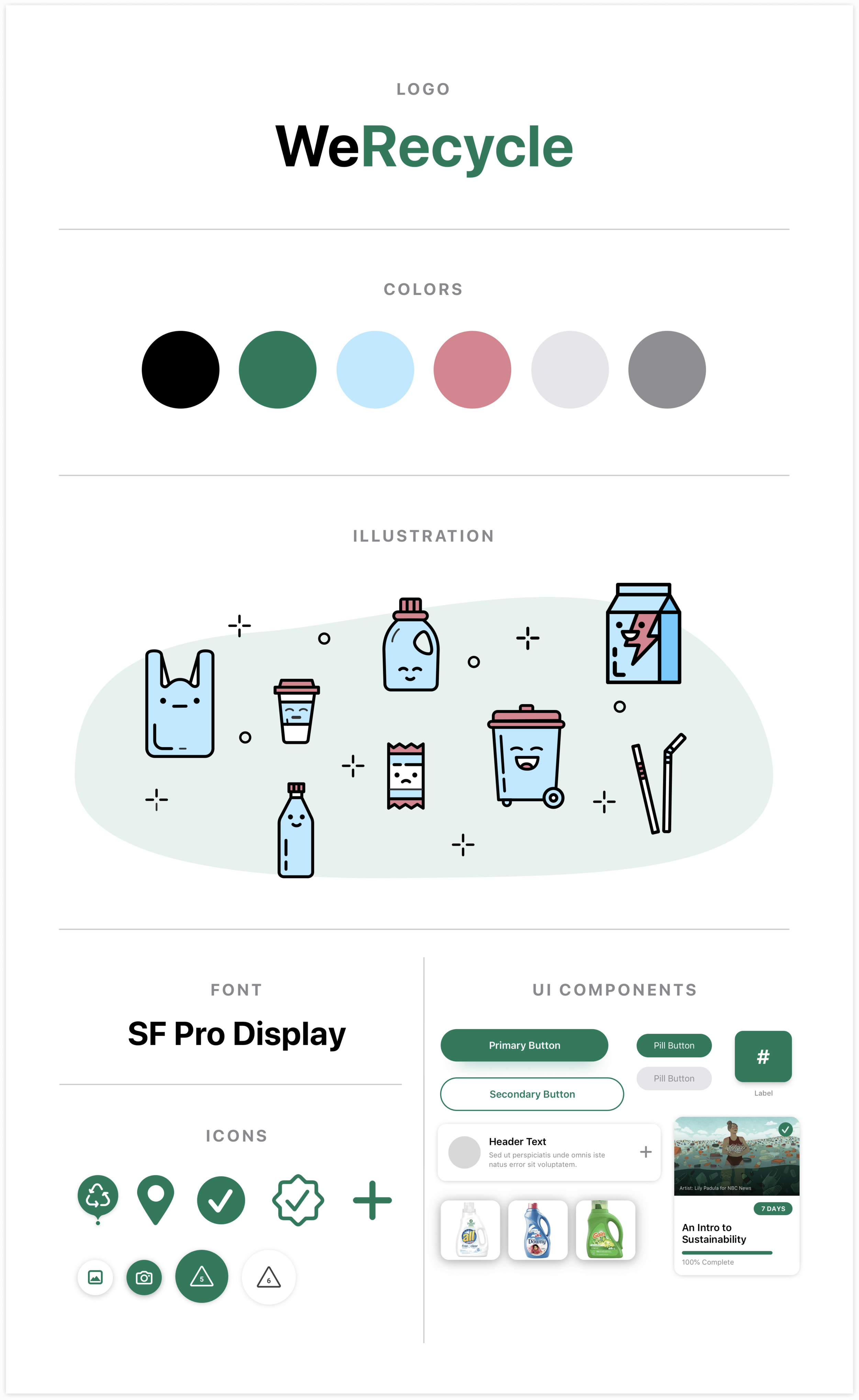
For user testing, I wanted to provide people with a visual experience of the WeRecycle app that was as close to reality as possible. I didn’t want to reinvent the wheel, so I used Apple Design Resources in Sketch as a launching point to define typography guidelines and design elements.
Logo
WeRecycle's logo is simple, with a focus on the word "Recycle" through the use of color, making it clear to users what the app is about at first glance.
Color
I selected a simple color palette of green and black to keep the design simple, with the lighter shade of green conveying a sense of youthful energy often associated with environmental initiatives.
Type
I chose to follow Apple’s Human Interface Guidelines to use SanFrancisco Display to maximize readability and take advantage of the Dynamic Type sizing feature.
User testing outcomes
I created a prototype of WeRecycle and tested it with 5 users, asking them to complete 6 tasks to observe how well they could use the app. Read my interview script and testing tasks here
Simplified search results
Users took some time to read through search results to determine recyclability, so I realized it needed improvement. I proposed a solution where users must identify a plastic number for plastic items before seeing results, simplifying outcomes to just "Yes" or "No".
Before

After

Integrate course content with the user’s Profile
Most users found the recycle log screen confusing due to its crowded layout and unclear connections between features. First, I reorganized the sections into a tabular navigation, allowing users to focus on one aspect at a time while still being able to switch between features. After this change, users had no trouble understanding the screen.
Users continued to have difficulty understanding that you could unlock modules within the “Learn” screen. I I made it simpler by moving this content to the user's profile and rebranding them as courses..
Redesign
After two years, I decided to give this project a redesign to gauge my progress as a designer. Below, you can compare the old and new designs.
Old designs

New designs
